
WES Architecture Design Website Styles
Here you can reference the typography hierarchy, color application, and the use of saved sections that are aligned with your branding. Please also view the video available in the button below on how to use this guide, as well as the built-in Squarespace style features.
Typography Hierarchy
This is Heading 1
This is your largest text. Limit the use of this Heading size and style for impactful title sections (i.e. it is only used on the hero section on the homepage for brand proposition impact). For all other section titles, Heading 2 is used. The copywriting for these should be 1 - 5 words.
This is Heading 2
This is your second largest text. Use this for any section or page titles. The copywriting for these should can range from one word to a sentance.
This is Heading 3
This is your second sub-heading. Use this for titles for multiple items like lists
This is Heading 4
This is your smallest heading. Use this for sub-titles in groups of items like lists, or longer-form statements that are 1-2 sentences long.
This is Paragraph 1
This is your largest paragraph or body text. This style is reserved for stand-out text like your testimonials.
This is Paragraph 2
Use this for the majority of your longform copy, with 1-3 paragraphs.
This is Paragraph 3
This is your smallest paragraph size, use this for footnotes, or secondary body information.
This is MONOSPACEThis is a sub-heading style, used for secondary information
Color Guide
Below are the suggested section background color schemes when adding new sections to the website. Each section has colors already assigned to the elements such as the texts and buttons. The order of these background section colors reflect the frequency of their use. I.e. Primary Section Background - Light, would be used first, then followed by the descending color schemes, to distinguish between sections which include different information.
Primary Section Background Color Scheme - Light 1
This is called “Light 1”. This is a primary section background color scheme in light.
Text color should be Black.
Secondary Section Background Color Scheme - Lightest 1
This is called “Light 1”. This is a primary section background color scheme in light.
Text color should be Black.
Tertiary Section Background Color Scheme - Dark 2
This is called “Dark”. This is a tertiary section background color scheme in your brand dark green. It is exclusively for your footer.
Text color should be White.
Utilizing Saved Sections
Below are a sampling of the saved sections within your website. When you go to add a new section, click on “Saved Sections” on the left-side menu, and you will see your specific site-styled sections already designed and built that you can add anywhere. Then, you can customize that section with changes to the texts, images, and colors to suit that section’s information.
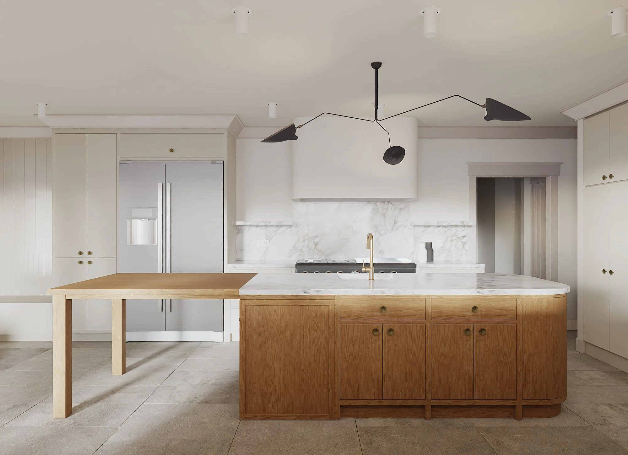
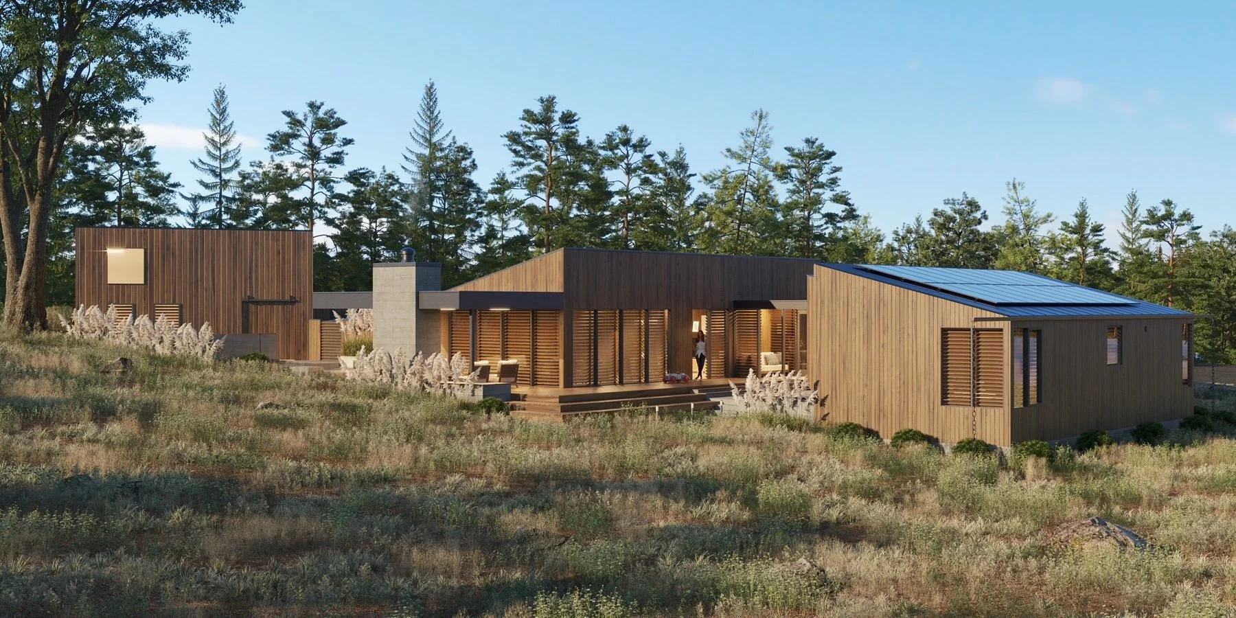
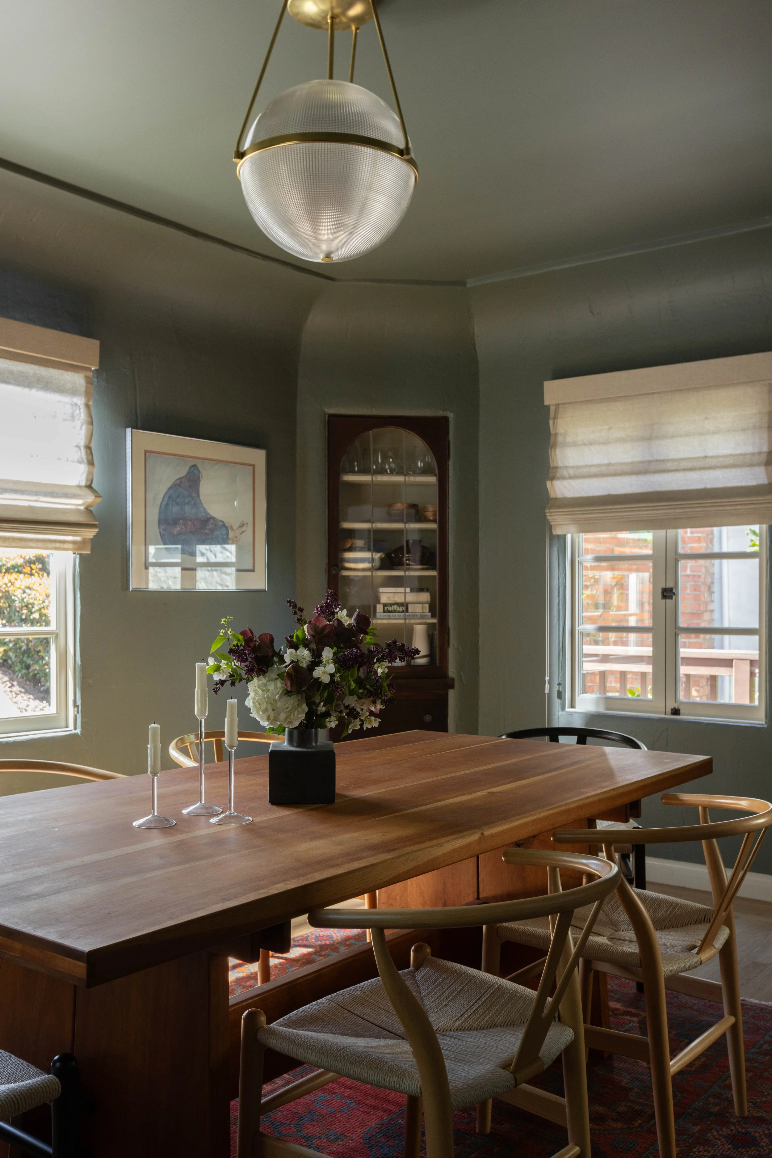
Full-bleed hero section
Used on the homepage, but can be used elsewhere on the website as a hero section.
To change the image, click on "“Background”
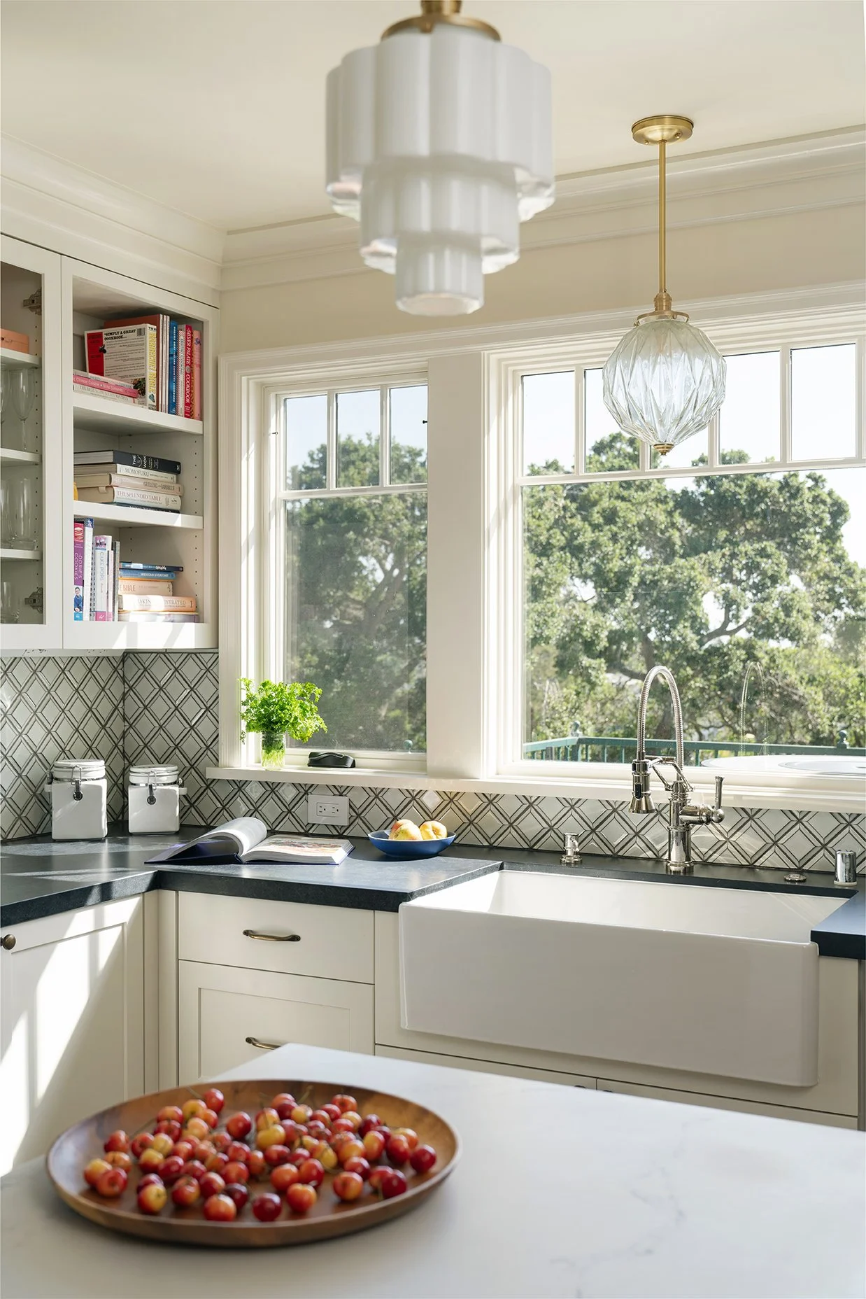
Full Bleed Slideshow
If you ever want to replace your first hero section on the homepage with a slideshow, you can utilize the section style below. I would not recommend layering text on top, unless you were curating images carefully that contained enough negative space within them to do so, to ensure your images and text were not visually competing with one another.
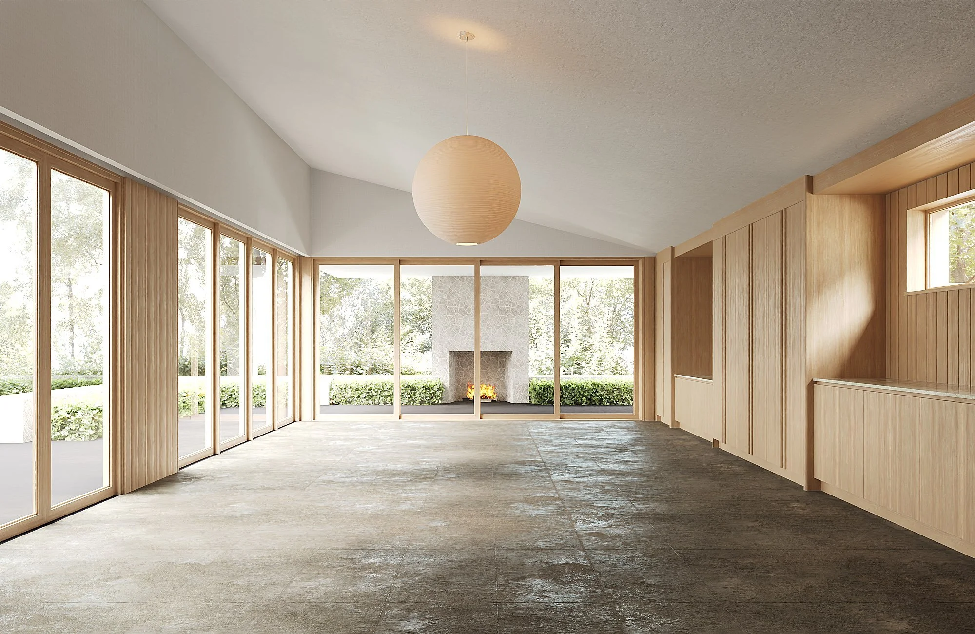
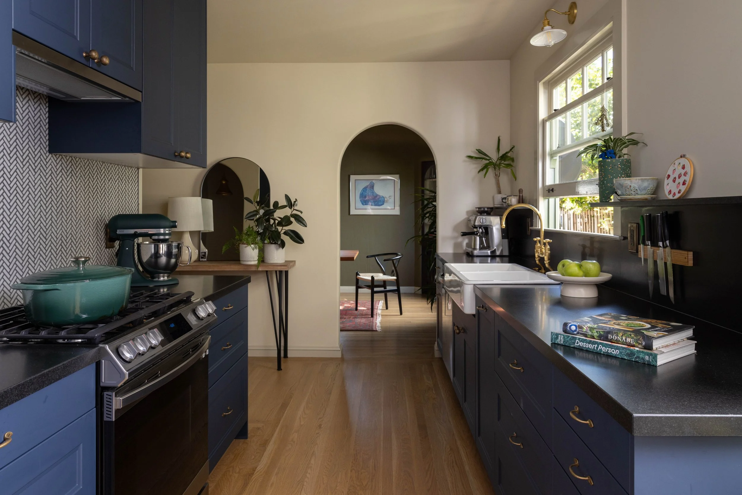
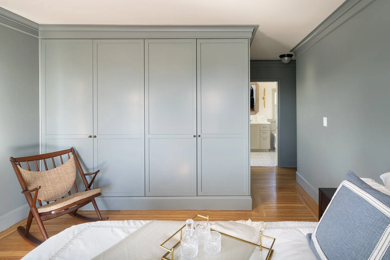
Left-Aligned Section with Border and Two Images
Replicate this section anywhere you are introducing a new topic or information about your business within a page. Select relevant imagery to accompany the heading and body text. Adjust the button text and link as needed. Ensure you adjust the spacing after inputting your content.
This type of section style can contain a lot of information and allow for an image to take up half of the section content. Utilize the formatted below titles and paragraphs when needing to list out information.
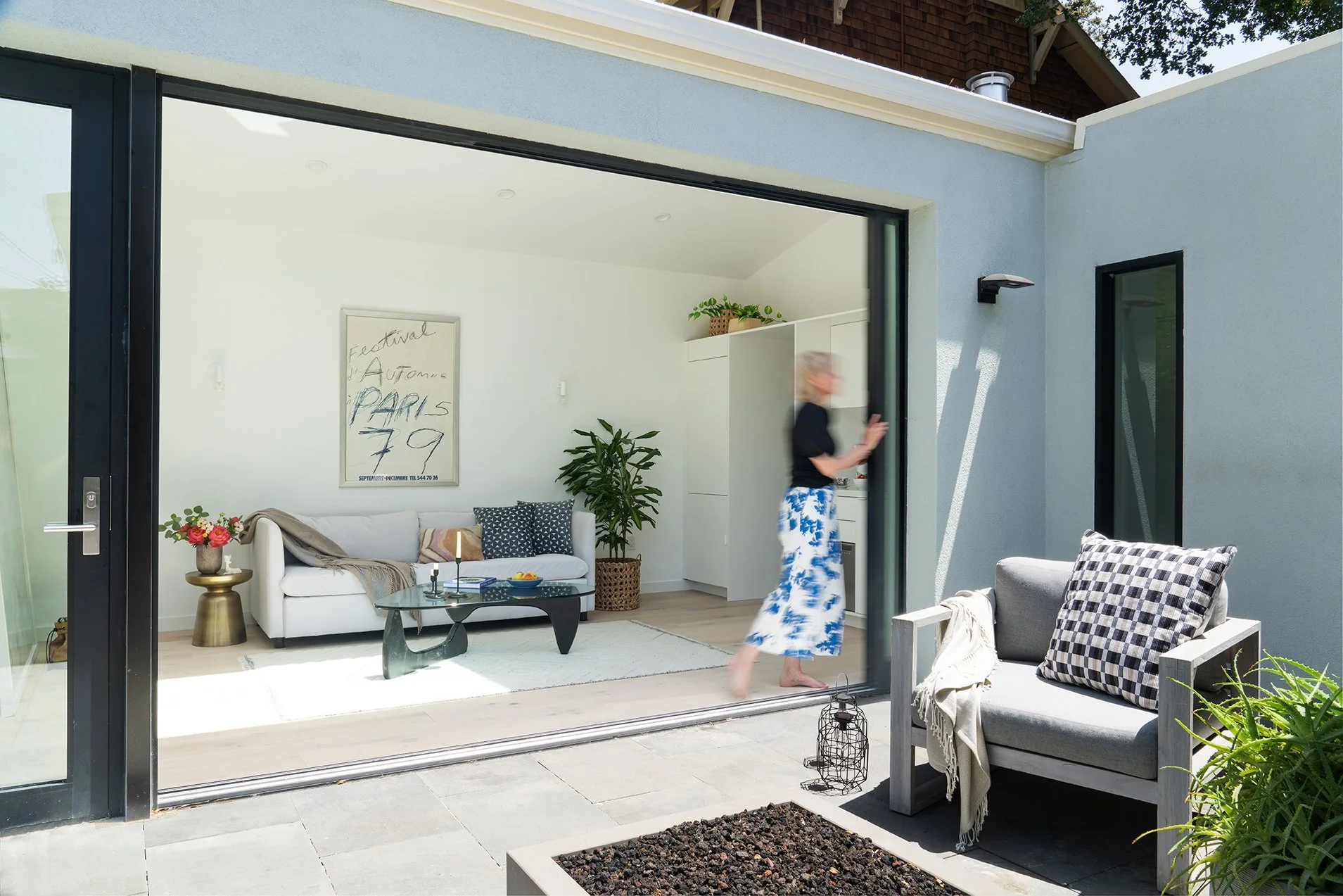
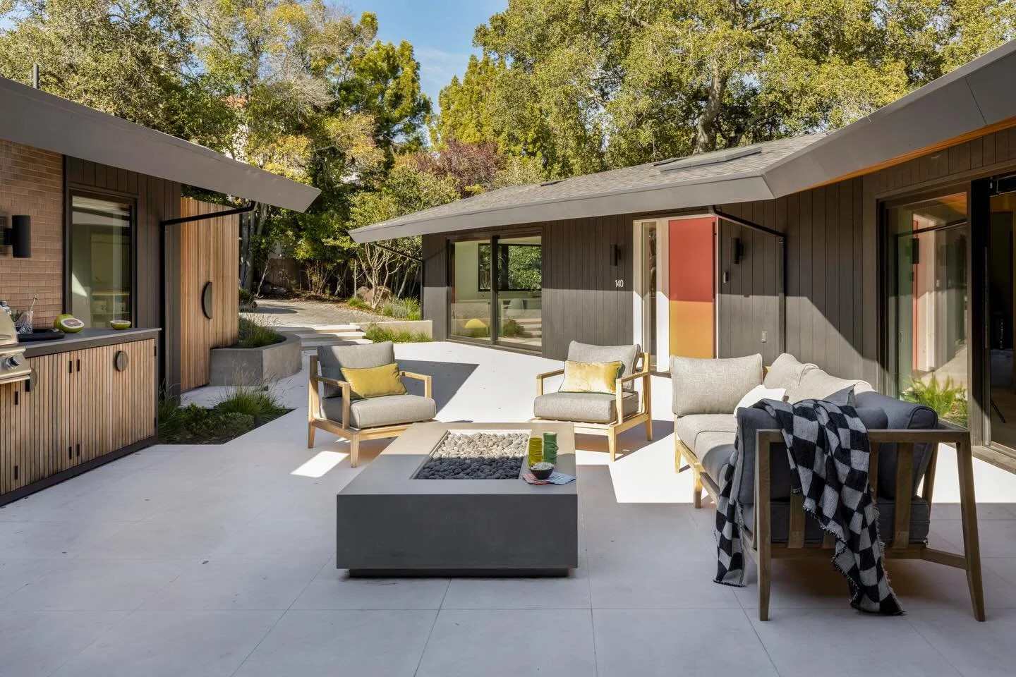
Right-Aligned Full-Bleed Split Section
Topic 1:
[Placeholder Text: Does your home no longer feel like "you"? Our interior design services help you define and express your aesthetic. Through bespoke furnishing designs, color palettes, accessorizing, and window treatments, we create a truly personal and timeless space.]
Topic 2:
[Placeholder Text: Feeling cramped or that your home no longer supports your life? We reconfigure and expand your existing space with a thoughtful, strategic approach, ensuring every square foot is optimized to work for you.]
Topic 3:
[Placeholder Text: The journey to building a new home is complex, but it doesn't have to be overwhelming. We collaborate with you to define and build the home you've always imagined, transforming your dream into a tangible reality with our expert guidance.]
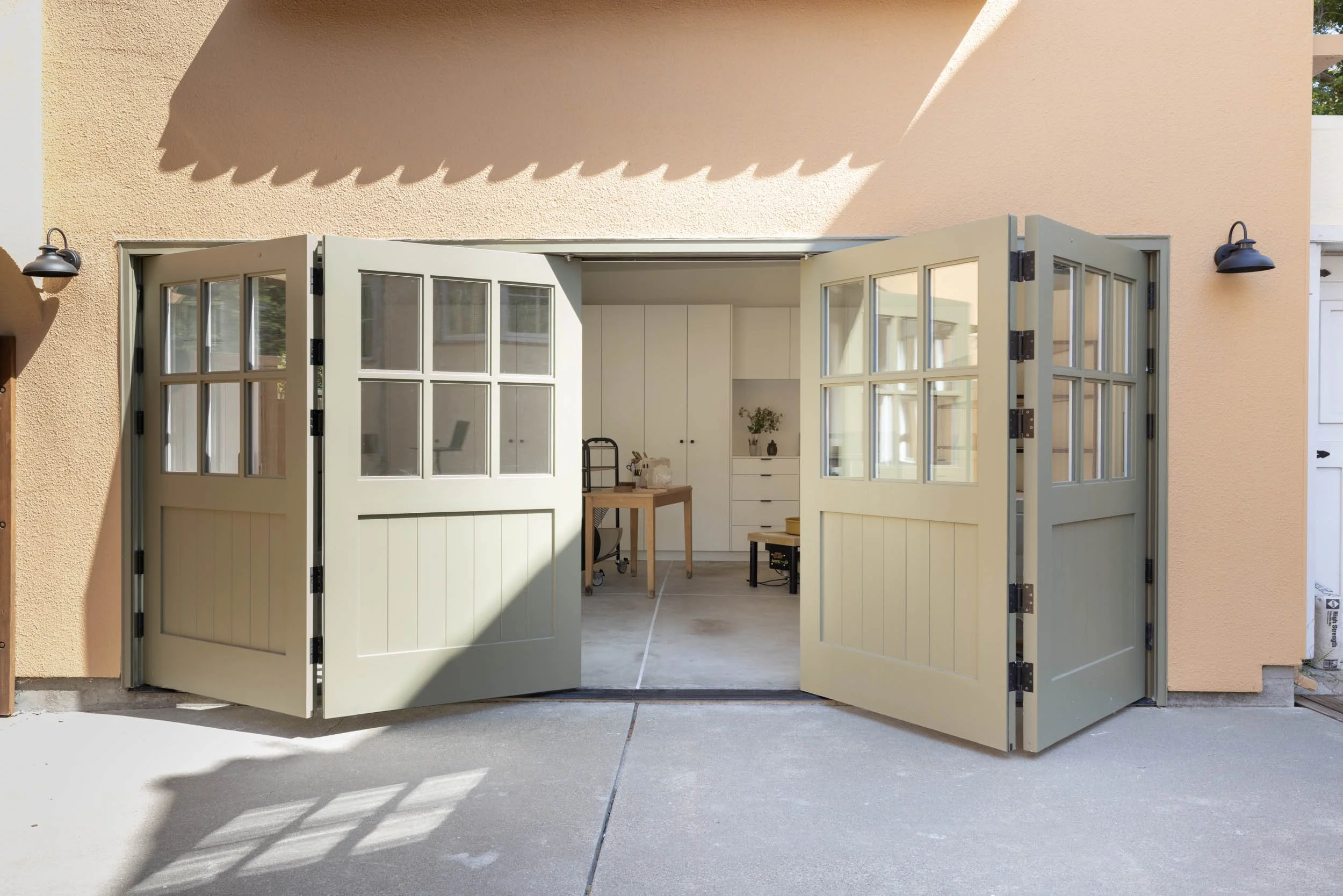
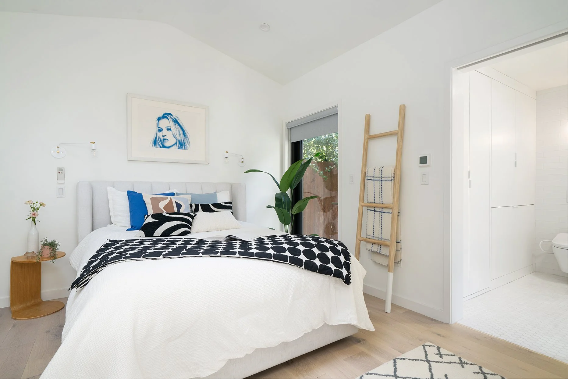
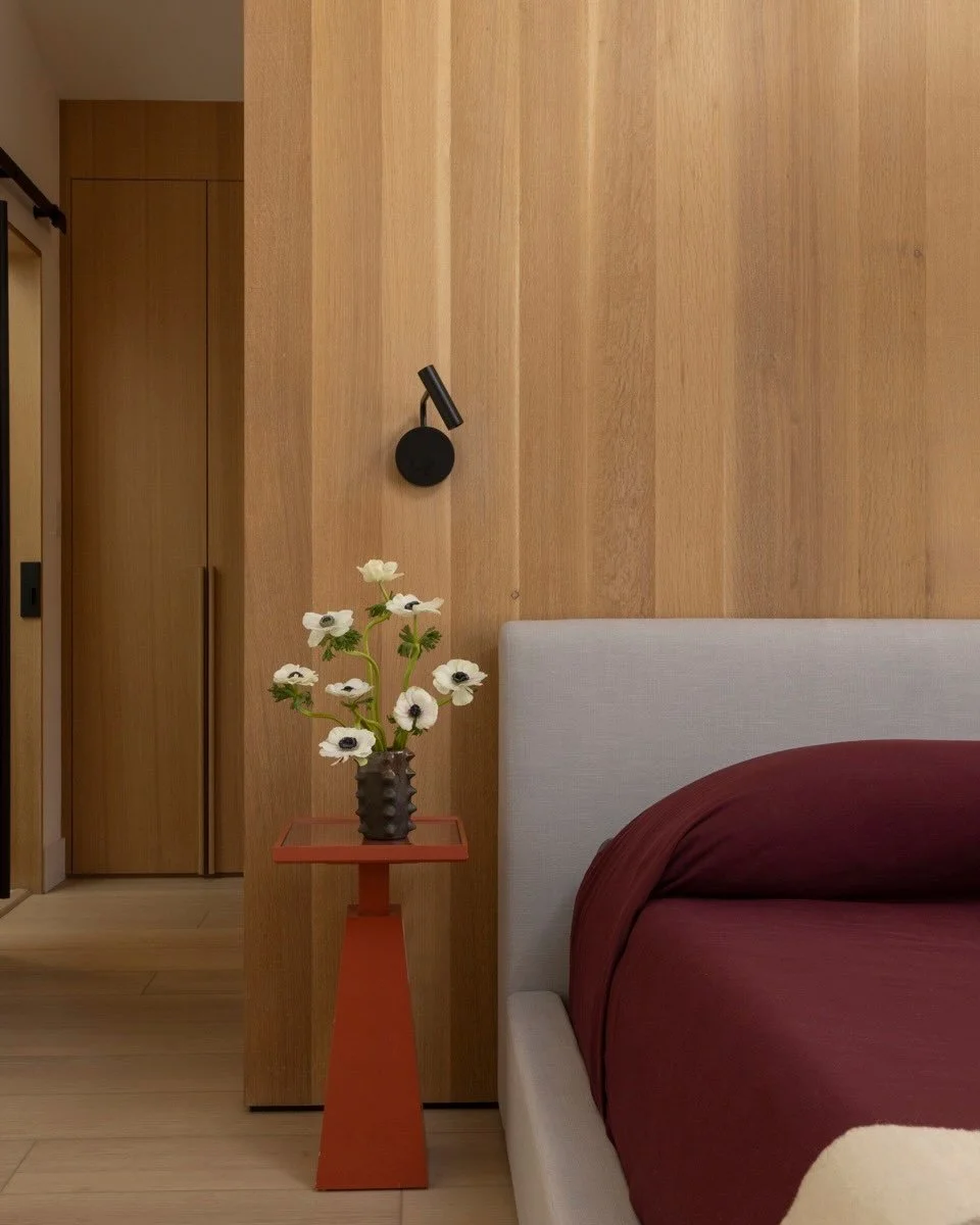
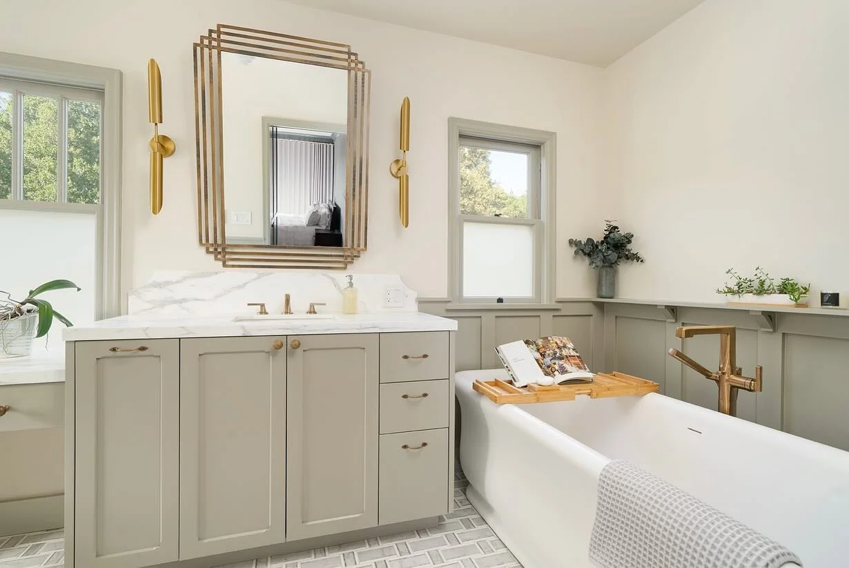
Lef-Aligned Single Image Section with Border
Here is a section with a border, single image, and with a heading and body text that are left-aligned.
[Placeholder text: Our work is to understand the interconnections that physical space can create; movement or views between outdoors and in, framed visual connections from one space to another, stylistic hints from our time to another, crossed paths of inhabitants and shared activities within. Our mission is to design the physical framework that encourages richer, more connected living.]
A Call to Action Section. Simple hook and button to convert view to interaction.
"This is a left-aligned testimonial section with a square image accompanying it. Edit your testimonial to be the length of this image or adjust the image accordingly. "
— [CLIENT INITIALS, Location, STATE]
“This is a testimonial style section with no image. This format can provide a break in your pages to focus just on a testimonial, with no images accompanying it.”
— [CLIENT INITIALS, Location, STATE]
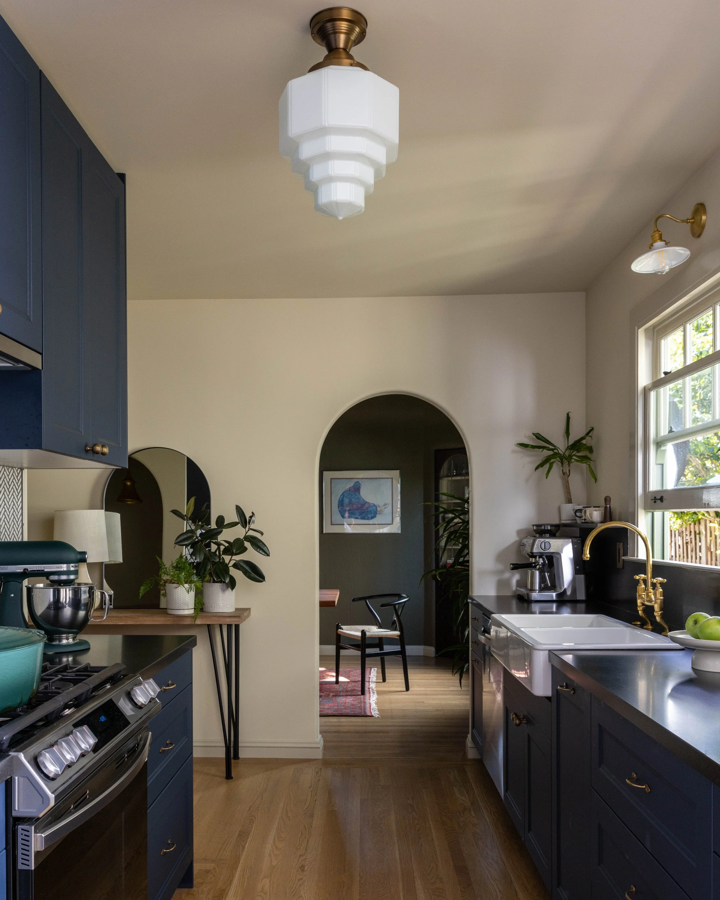
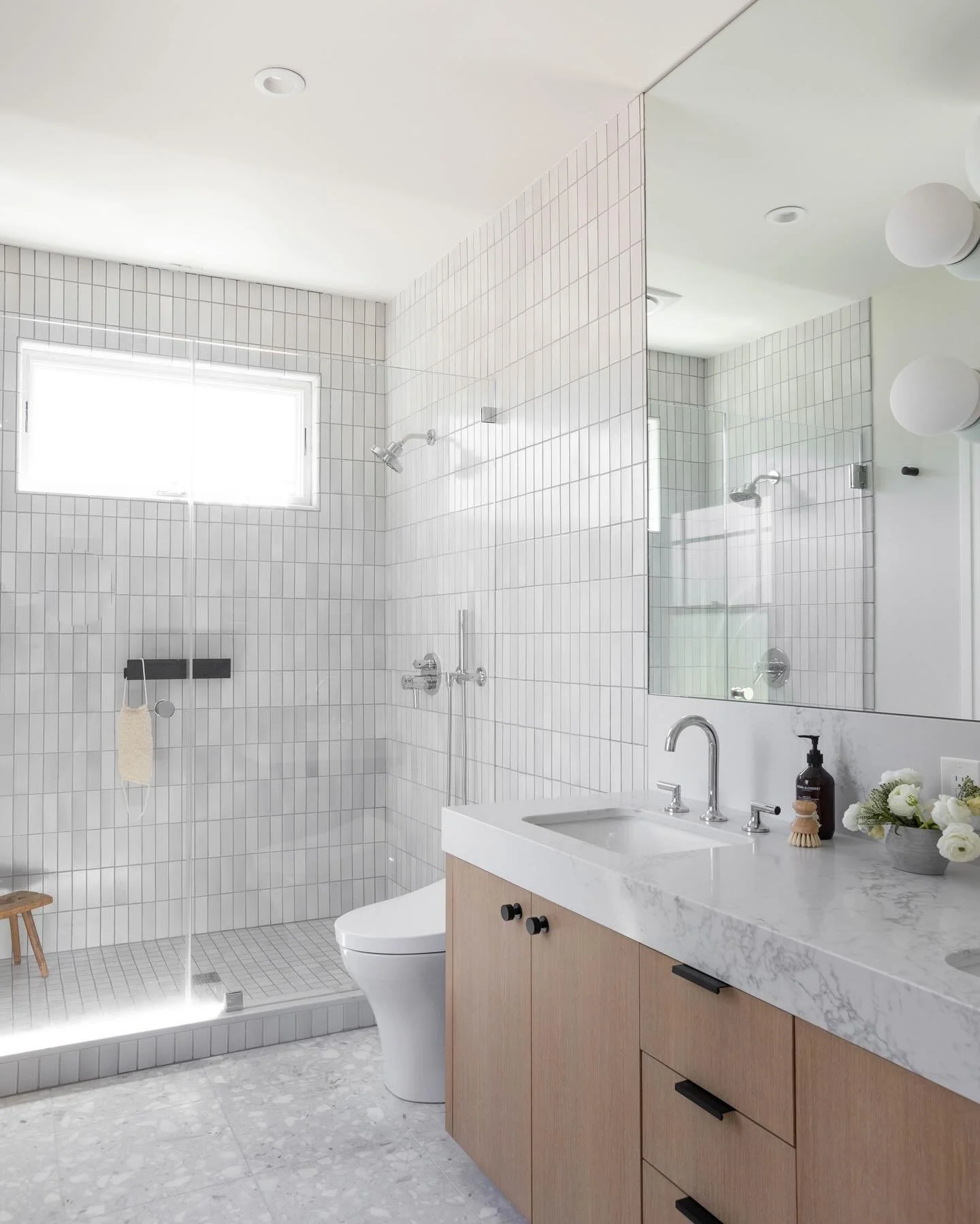
Split Section with Full-Bleed Square Image
This type of section is hero section that contains both text and an image. It doesn’t contain a button but you can add one if you need.
sub-headerTopic 1
Use this 3-column section to divide different information into categories and expand on them. This is used in your services section, but can be applied to any other aspects of your business. You can add a fourth column if needed, view how to do this in the Editing Your Services Page tutorial video.
sub-header[Placeholder Text: We partner with you to strategically unlock your home's full potential. We work directly with local Planning and Building Departments, navigating complex regulations to find smart, effective solutions that bring your vision to life.]
Topic 2
sub-headerTopic 3
[Placeholder Text: We think strategically to maximize your property's potential as a home and as an investment. We call upon years of experience to ensure that the path is as smooth and efficient as possible.]
[full-bleed horizontal crop image]
Two Column Section
Here is a section you can used to present two separate but related messages or pieces of information. It is a text-only styled section.
Second Column
[Placeholder text: We approach each project with a sense of deep empathy and a holistic perspective, crafting a narrative through design that connects every element of a home. We work with a deep respect for craftsmanship, the foundational character of the site and for the choreography of your life, always remembering that what we build will live for decades into the future.
Split Section with Border and Inset Image
This section contains an inset image (as opposed to full-bleed), right-aligned text with a header and body copy, and a border in the section.

Instagram Block - Add wherever you want to link your IG
Contact Form Section
This section hosts your contact form. You can either use the same contact form in multiple places, or use different ones in different places depending on your inquiry needs. To edit the contact form, click on the block below and edit the fields directly. Make sure you check the “Storage” tab to see where the inquiry forms will be sent when someone submits. Also make sure to properly name your contact form so when it arrives in your inbox you are able to identify it.